AMP의 유용한 레이아웃 속성 중 하나인 flex-item은 플렉스가 적용된 상위 요소에서 자식 요소가 사용 가능한 모든 공간을 차지합니다. 이를 사용하여 여러 가지 레이아웃을 만들 수 있는데 그 중 몇 가지를 간략히 살펴보겠습니다.
1. flex-item 가로 배열
flex-item은 기본값으로 가로로 정렬되어 있습니다. 다음 CSS 코드에서 부모 요소는 고정된 크기이고, 너비는 높이의 세 배로 지정했습니다.
.flex-container-row {
  display: flex;
  flex-direction: row;
  width: 450px;
  height: 150px;
}
다음 마크 업은 플렉스 컨테이너 내에서 자식 요소의 수가 증가합니다.
<div class="flex-container-row">
  <!-- 1 flex item -->
  <amp-img src="img/placeholder.png" layout="flex-item"></amp-img>
</div>

<div class="flex-container-row">
  <!-- 2 flex items -->
  <amp-img src="img/placeholder.png" layout="flex-item"></amp-img>
  <amp-img src="img/placeholder.png" layout="flex-item"></amp-img>
</div>
...

<div class="flex-container-row">
  <!-- 7 flex items -->
  <amp-img src="img/placeholder.png" layout="flex-item"></amp-img>
  <amp-img src="img/placeholder.png" layout="flex-item"></amp-img>
  ...
</div>
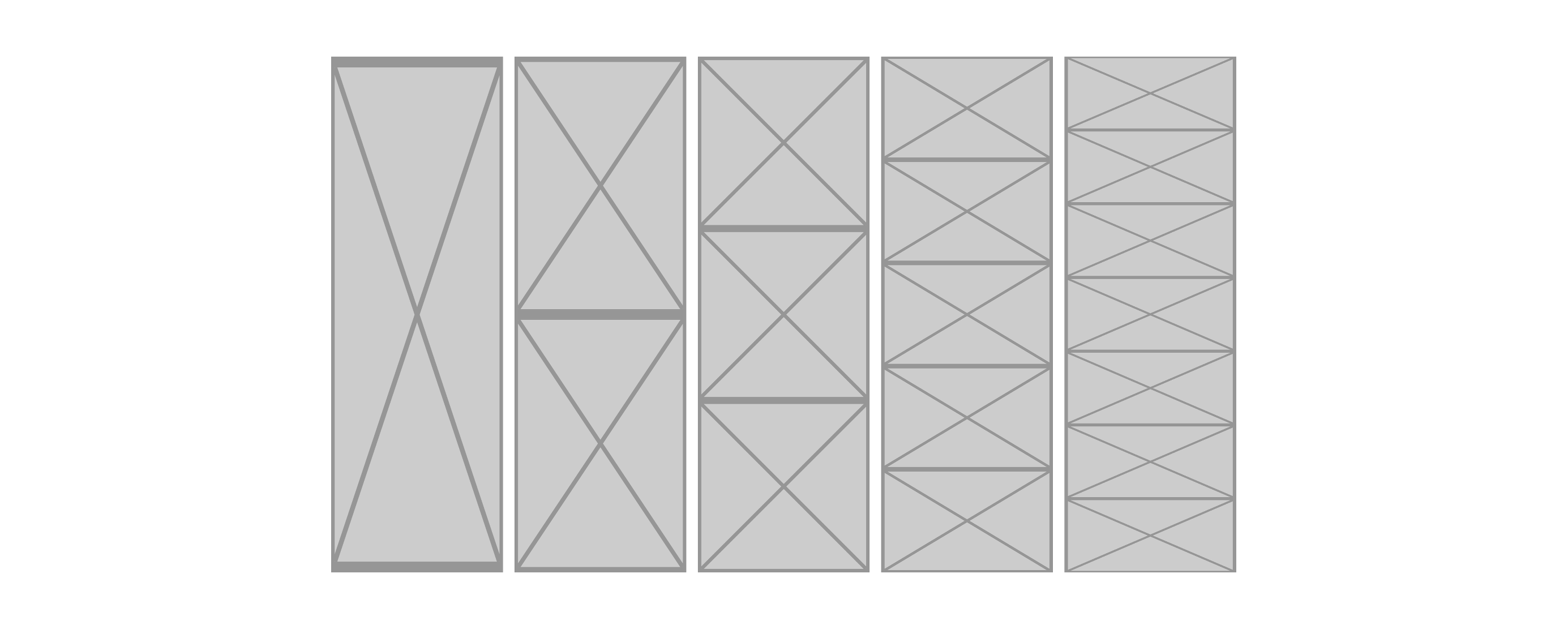
다음 이미지는 플렉스 컨테이너 내에 1 ~ 7 개의 플렉스 아이템이 있는 모습입니다. 각각의 플렉스 아이템으로 정사각형의 이미지가 사용되었습니다. 플렉스 컨테이너 내에 얼마나 많은 아이템들이 있는지에 따라 플렉스 아이템의 너비가 어떻게 늘어나는지 확인할 수 있습니다. 컨테이너의 너비가 높이의 3배이기 때문에 이미지가 세 개가 있을 때만 늘어나지 않고 정상적으로 표시됩니다.
2. flex-item 세로 배열
플렉스 아이템은 세로로 배열할 수도 있습니다. 이번에는 부모의 너비와 높이 치수를 반대로 하여 높이가 너비의 세 배가 되도록 합니다.
.flex-container-col {
  display: flex;
  flex-direction: col;
  width: 150px;
  height: 450px;
}
<div class="flex-container-col">
  <!-- 1 flex item -->
  <amp-img src="img/placeholder.png" layout="flex-item"></amp-img>
</div>

<div class="flex-container-col">
  <!-- 2 flex items -->
  <amp-img src="img/placeholder.png" layout="flex-item"></amp-img>
  <amp-img src="img/placeholder.png" layout="flex-item"></amp-img>
</div>
...

<div class="flex-container-col">
  <!-- 7 flex items -->
  <amp-img src="img/placeholder.png" layout="flex-item"></amp-img>
  <amp-img src="img/placeholder.png" layout="flex-item"></amp-img>
  ...
</div>
앞의 예제들에서 플렉스 아이템들이 어떻게 배열되는지 알아보았습니다. 이것은 컨테이너 내에서 항목들을 나열하는 데는 좋지만 이미지에 대해서는 아닐 수도 있습니다.
3. 전체 너비일 때 flex-item
부모 컨테이너가 페이지의 전체 너비와 같다면 부모의 너비와 높이 값을 생략할 수 있지만 자식 요소인 flex-item에 대한 높이 값을 제공해야 합니다.
.flex-container-row {
  display: flex;
  flex-direction: row;
}
<div class="flex-container-row">
  <amp-img src="img/placeholder.png" layout="flex-item" height="200"></amp-img>
  <amp-img src="img/placeholder.png" layout="flex-item" height="100"></amp-img>
</div>
4. 특정 비율일 때 flex-item
플렉스 레이아웃의 각 항목에 대해 특정 비율을 지정할 수도 있습니다. 다음 코드는 세 개의 플렉스 아이템 사이의 공간을 25-50-25로 분할합니다.
.flex-50 {
  flex-basis: 50%;
}

.flex-25 {
  flex-basis: 25%;
}
<div class="flex-container-row">
  <amp-img class="flex-25" src="img/placeholder.png" layout="flex-item"></amp-img>
  <amp-img class="flex-50" src="img/placeholder.png" layout="flex-item"></amp-img>
  <amp-img class="flex-25" src="img/placeholder.png" layout="flex-item"></amp-img>
</div>
5. flex와 non-flex 혼합
플렉스 컨테이너 내에서 flex와 non flex를 함께 사용할 수도 있습니다. 플렉스가 아닌 항목은 width 및 height 속성을 반드시 선언해야 하며 나머지 남는 공간은 flex-item 간에 나뉘어 배치됩니다.
<div class="flex-container-row">
  <amp-img src="img/placeholder.png" width="250" height="150" flexed></amp-img>
  <amp-img src="img/placeholder.png" height="150" layout="flex-item"></amp-img>
  <amp-img src="img/placeholder.png" layout="flex-item"></amp-img>
  <amp-img src="img/placeholder.png" layout="flex-item"></amp-img>
</div>
정사각형 이미지와 함께 플렉스 레이아웃이 이미지 구성 요소에 미치는 영향에 대해 알아보았습니다. 다른 구성 요소와 함께 레이아웃을 적용할 때 이렇게 이미지가 왜곡되어 나타날 것이라고 예상할 수 있는 것은 매우 중요합니다.